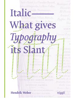
Look inside
|
Italic: What Gives Typography its Slant
ISBN: 9783721210095
(PB - E)
The use of italic letters as means of accentuation has become common practice in the digital age. They convey movement and dynamics, address the emotional experience of reading and remind of handwriting. However, this lively characteristic, which once re-sulted from the movement of the hand, is noticeably lost when words are simply tilted by a mouse click.
To impart knowledge about this typo-graphic feature and to find a general definition as writing style, the author has compiled style patterns to examine the tangible forms, characteristics and functions of "italic nature". Furthermore, he deals intensively with the historical development of italics from handwriting to digital typesetting. This monograph is the first detailed treatise on this topic, and is aimed at all those who deal with letters professionally or privately
Having discovered a passion for type while studying graphic design, Hendrik Weber completed his graduate degree in type design. After a successful career as a free-lance type designer which included work-ing with major brands, type and design studios in Berlin, Munich and Amsterdam he joined Monotype to advise clients on bespoke type and develop new markets in branding as well as to supervise the devel-opment of the Monotype Library. He has designed several of his own fonts for the European foundry OurType, and has col-laborated with established brands including Canyon, Porsche and Bentley Motors.
|